Product design and interactive prototype
ChartStudio
Designing a Figma plugin prototype that helps product designers create consistent, accessible charts without rebuilding them manually.
ChartStudio explores how chart creation could become faster, more consistent and easier to govern within product-design teams. I designed the plugin experience, chart controls, responsive presets and accessibility rules, then used AI-assisted development to turn the concept into an interactive prototype.
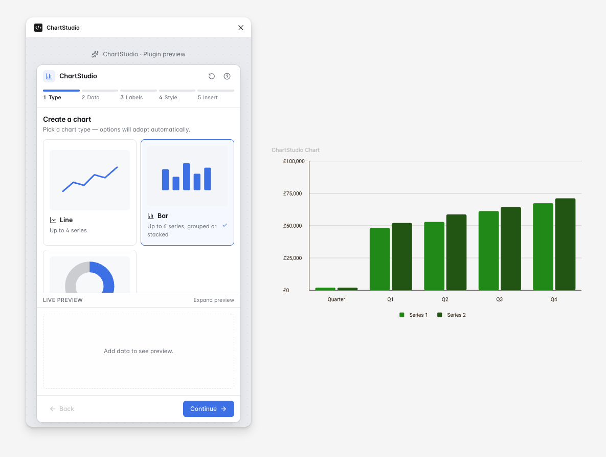
Project summary
- My role
- Product design, UI design, design systems and prototype direction
- Tools
- Figma, GitHub, Codex and AI-assisted development
- Focus
- Data visualisation, accessibility, responsive components and designer workflows
- Output
- Interactive Figma plugin prototype
- Status
- Prototype under continued development and validation
What I owned
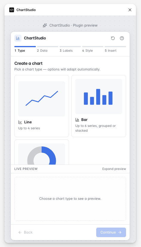
I led the product concept, interaction model, interface design and chart-system rules. This included defining the plugin journey, responsive output sizes, chart configuration controls, accessibility options and the structure of the generated chart components.
- Product concept and workflow
- Plugin interface and interaction design
- Chart layout and responsive rules
- Accessible colour and labelling options
- Reusable component behaviour
- Prompting and directing AI-assisted development
- Reviewing the generated implementation and identifying issues
AI-assisted tools supported implementation, but the product direction, workflow, interface structure and chart-system decisions remained design-led.
The problem
Designers often need to create charts for product interfaces, dashboards and reports, but chart design becomes inconsistent when every chart is drawn manually. ChartStudio was designed as a Figma plugin prototype for making chart creation faster, more consistent and easier to align with shared product and accessibility standards.
Key product decisions
Decision 1: Guided workflow instead of one complex screen
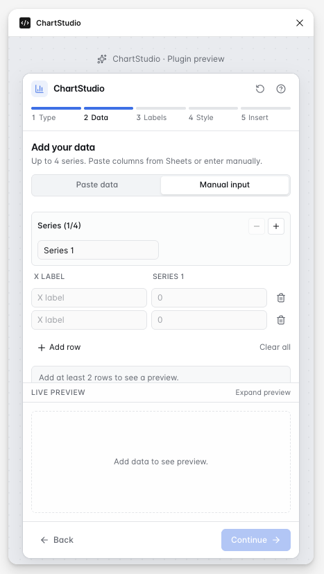
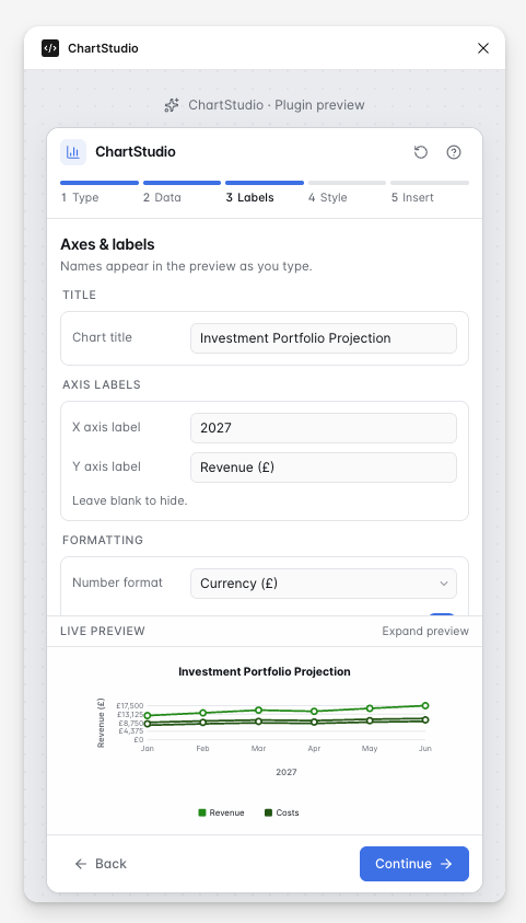
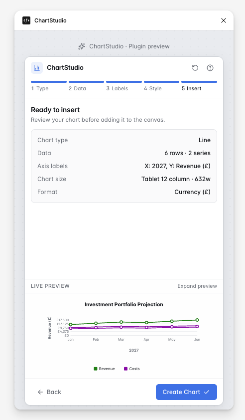
Chart creation was divided into manageable stages so designers could choose a chart, enter data, configure labels, select an output size and review the result without being overwhelmed by every control at once.
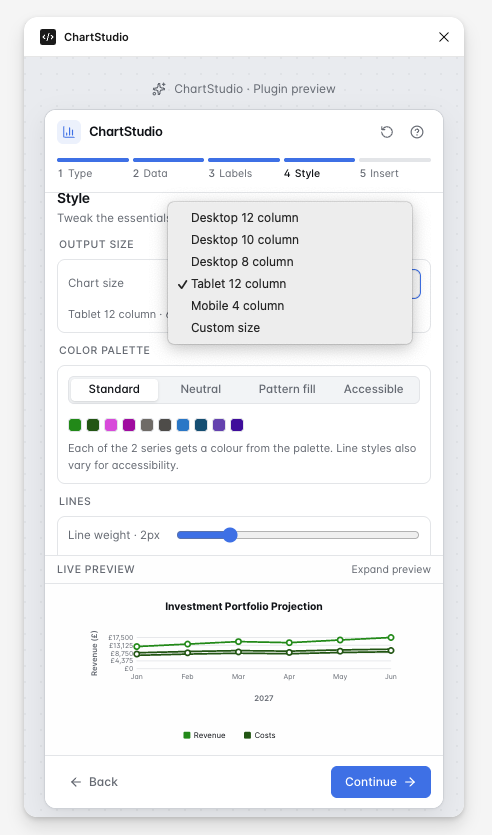
Decision 2: Preset responsive sizes instead of arbitrary resizing
Preset desktop, tablet and mobile dimensions help charts remain consistent within product layouts while still offering a custom-size option where needed.
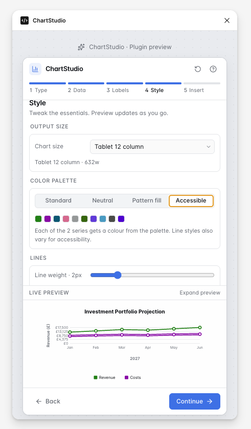
Decision 3: Accessibility controls as part of creation
Accessible palettes, clear labels, legends and readable value formatting were treated as core chart settings rather than an optional check at the end.
Accessibility and system rules
The plugin experience applies accessibility and system thinking directly to chart creation so each output can follow predictable visual rules.
- Accessible palette choices
- Clear chart titles and axis labels
- Legends that do not rely on colour alone
- Predictable spacing and alignment
- Responsive output presets
- Reusable visual rules across bar, line and doughnut charts
- Controls for values, labels and formatting
- Maintaining chart readability at smaller sizes
From design concept to working prototype
I used AI-assisted development to move beyond static interface designs and test how the proposed workflow could behave as a functioning plugin. I defined the required interactions, component behaviour, chart rules and acceptance criteria, then reviewed and refined the generated implementation.
This process involved identifying implementation issues, clarifying responsive behaviour, correcting chart layouts and iterating on controls until the prototype more closely matched the intended product experience.
Challenges and iterations
- Keeping doughnut charts circular at different sizes.
- Preventing labels and legends from overlapping.
- Aligning axis labels and grid lines so the preview felt intentional.
- Maintaining consistent spacing at different breakpoints.
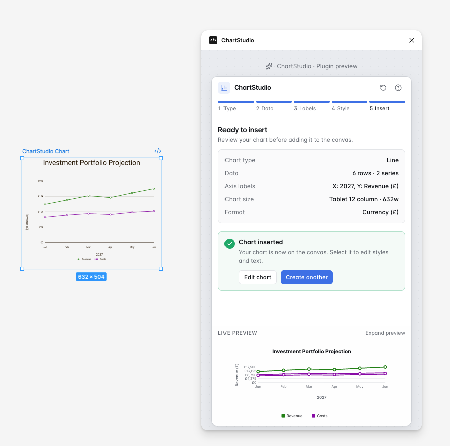
- Ensuring generated chart layers remain usable in Figma.
- Balancing configuration options with a simple guided workflow.
Prototype journey
The screenshots below follow the intended ChartStudio journey from selecting a chart format through to reviewing and inserting a finished chart into Figma.
Outcome and next steps
ChartStudio demonstrates how I use product thinking, UI systems and AI-assisted development to make a design concept tangible. The prototype brings the key chart-creation journey together in one guided experience and provides a foundation for further testing.
- Test the workflow with product designers
- Measure task completion and chart-creation time
- Refine the controls based on observed usability issues
- Validate keyboard and screen-reader behaviour
- Improve generated Figma layer structure
- Explore importing data from CSV files
- Prepare the plugin for wider distribution if validation is positive